A digital consultancy built from the ground up to help small Argentine companies turn complexity into profitability.
I led the project end-to-end: naming, visual identity, web design, and the social media system the team uses to reach new clients.
We started working with Pablo, one of its founders, from the beginning. We think of a unique name with solid concepts behind it and then we work on the visual identity. Social media and the website were important to have a solid foundation and to be able to go out and find clients.
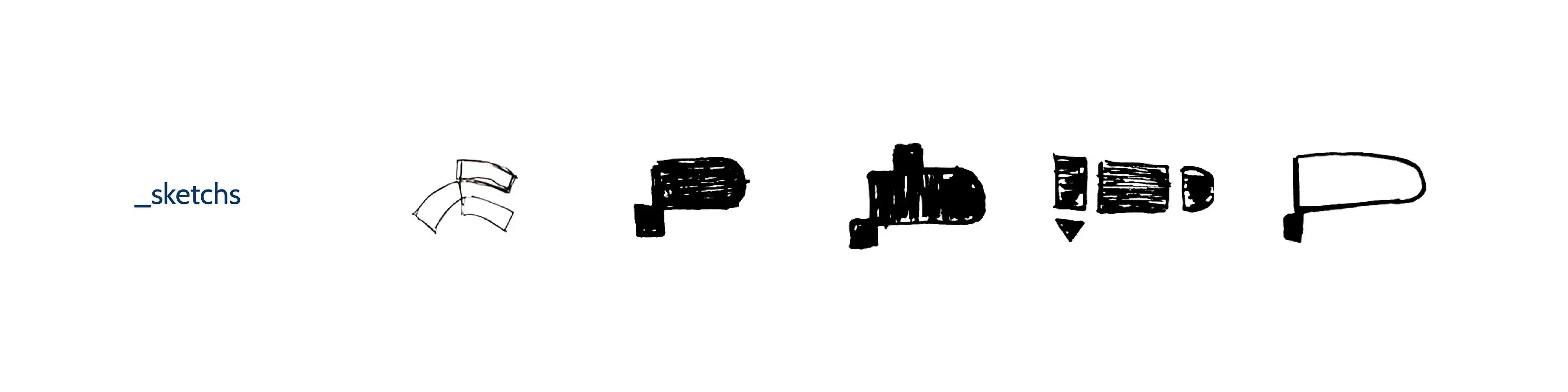
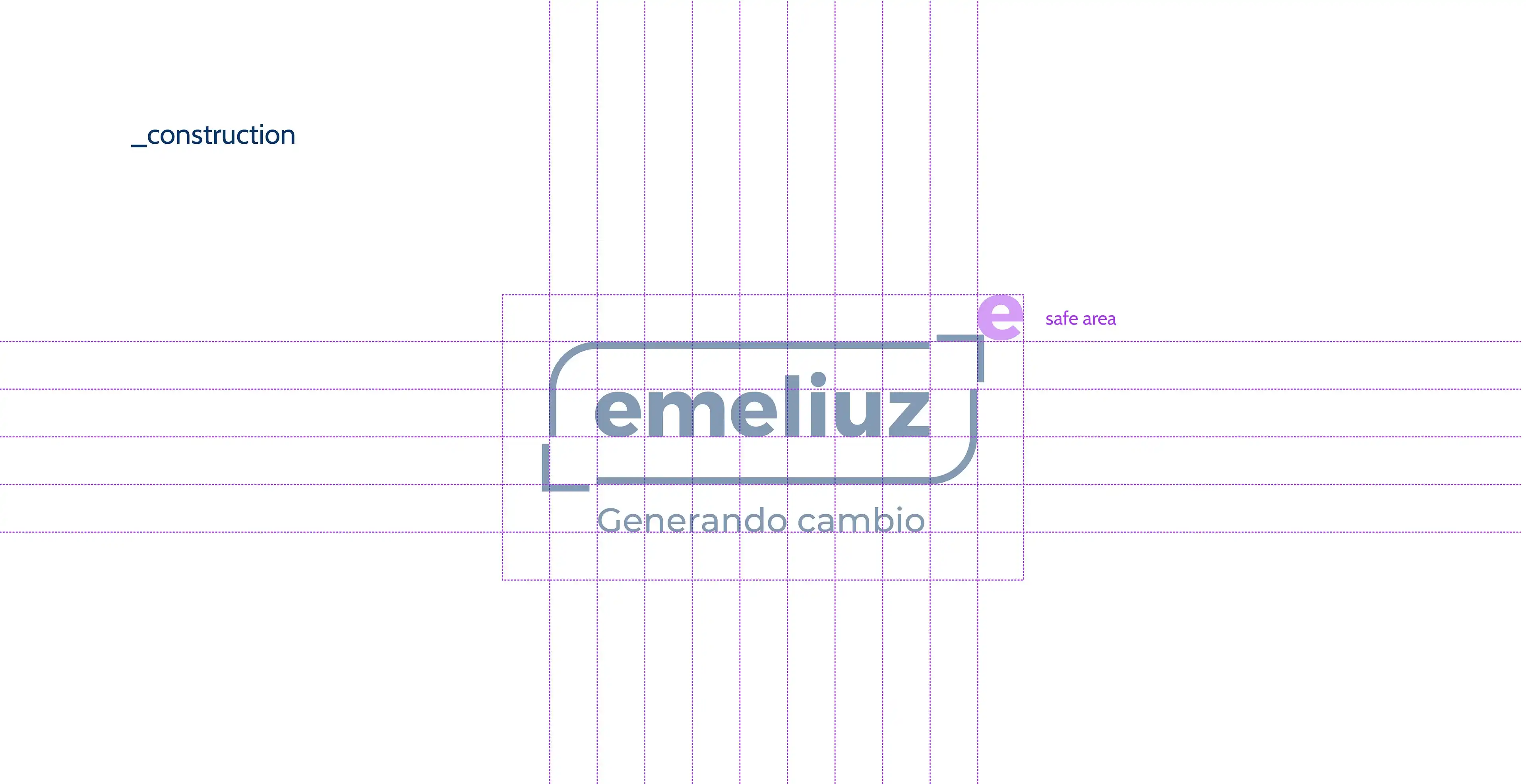
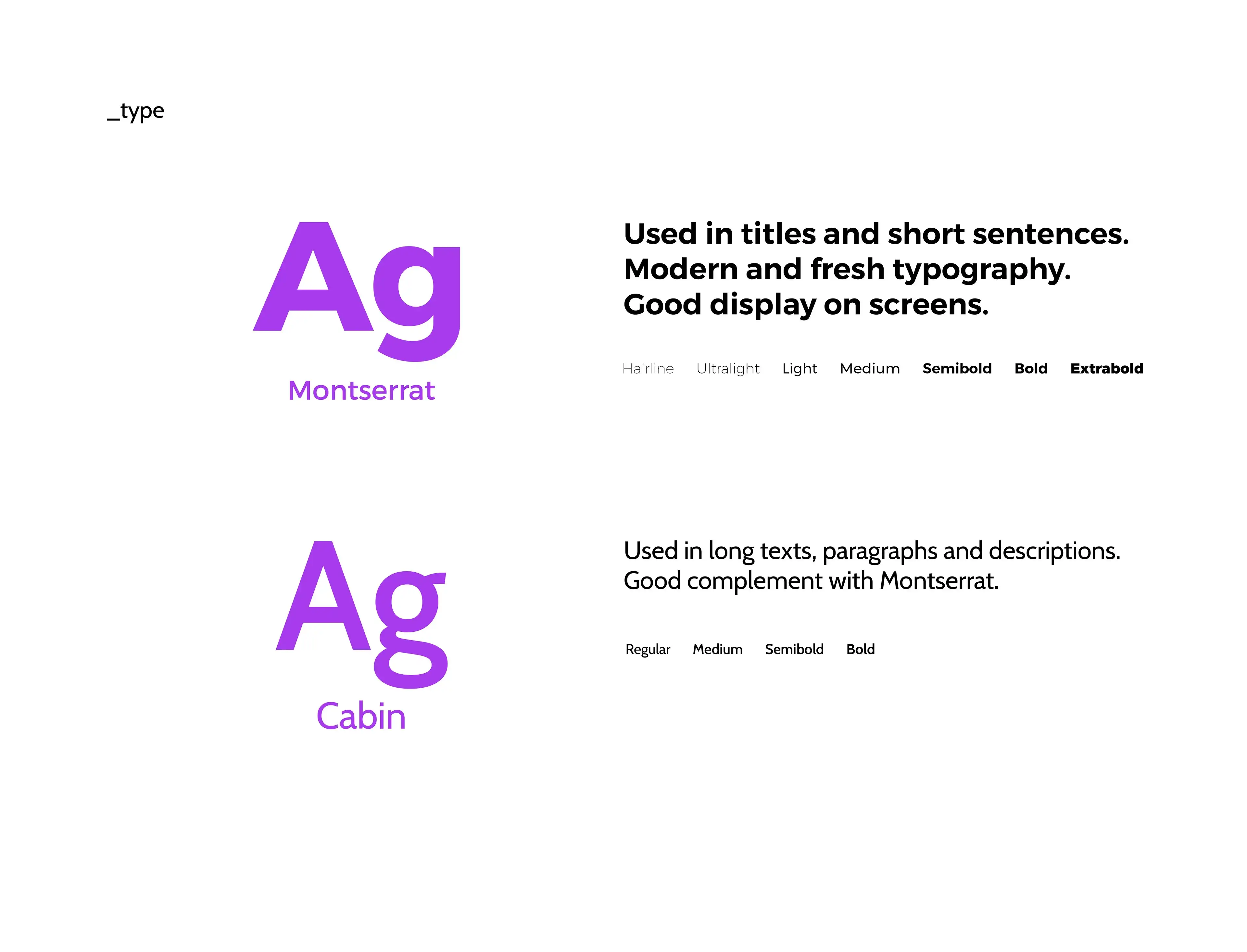
The process started by defining the core concepts, then a grid, and finally the visual language that would carry the brand across every touchpoint.
Overcoming, Digital, Energy, Exergy, Iteration, Adaptability
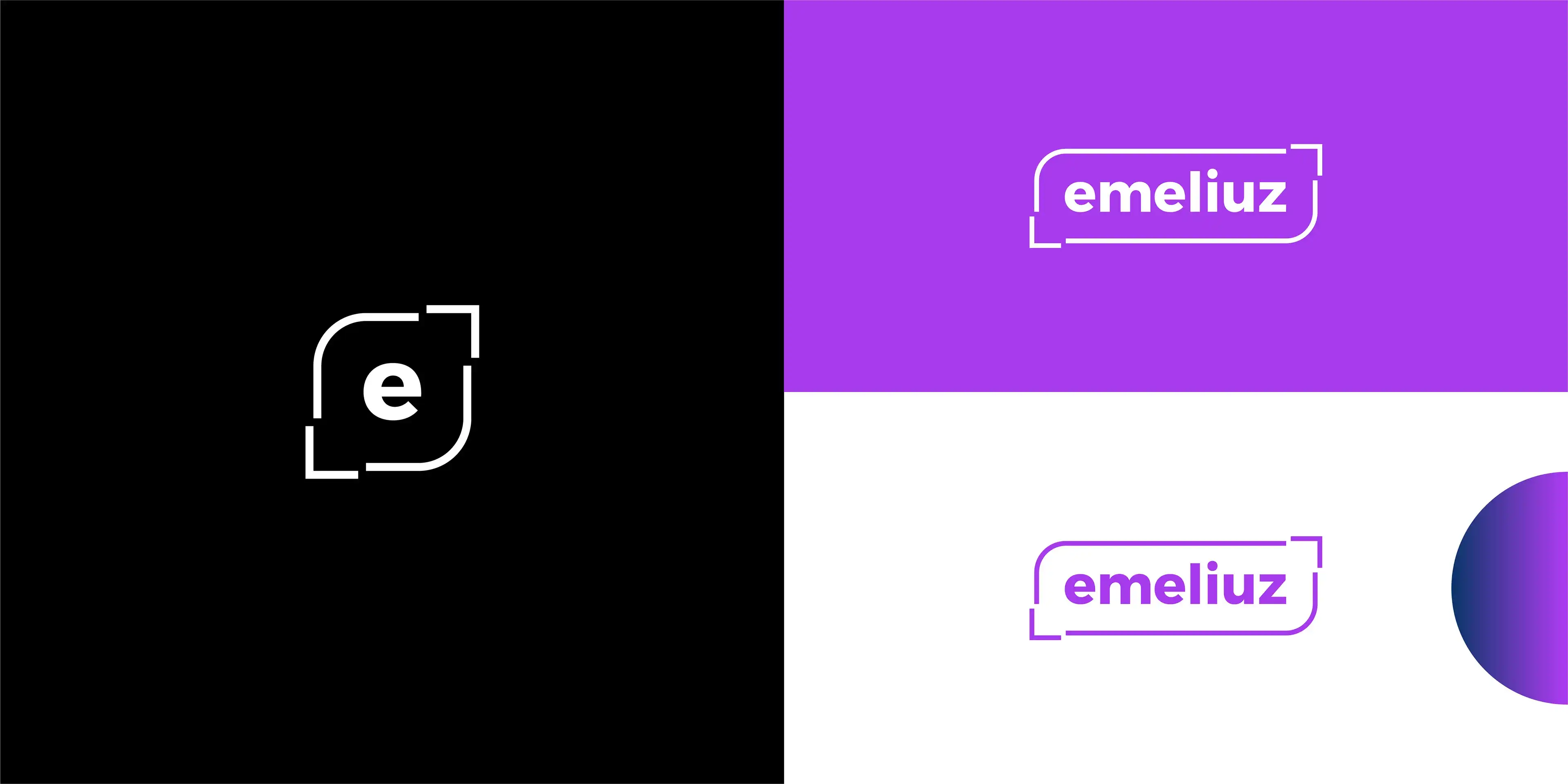
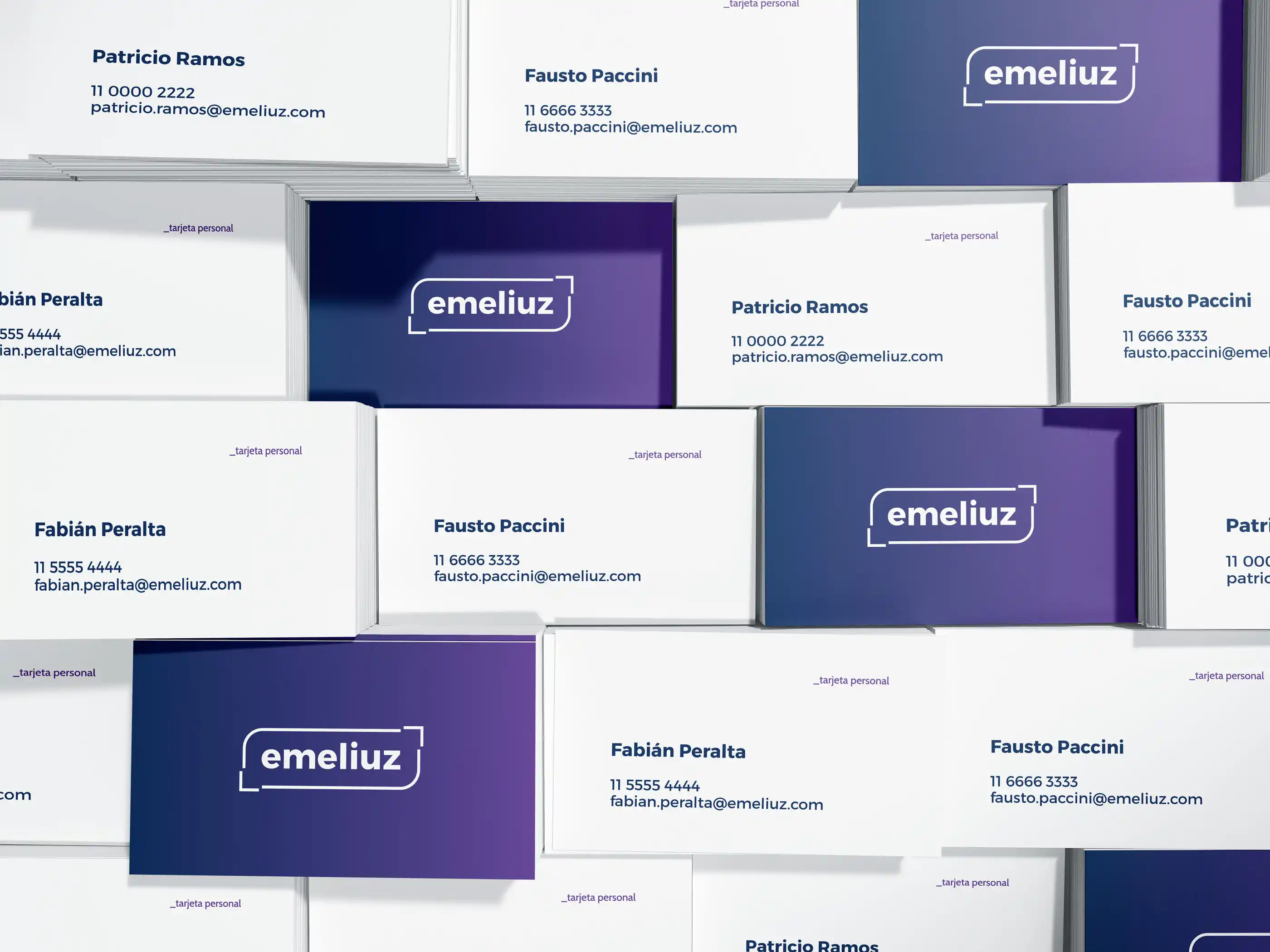
A flexible grid was used, featuring the presence of the isologotype shape throughout the visual system.
Tech, Code, Expansion, Iteration, Messaging

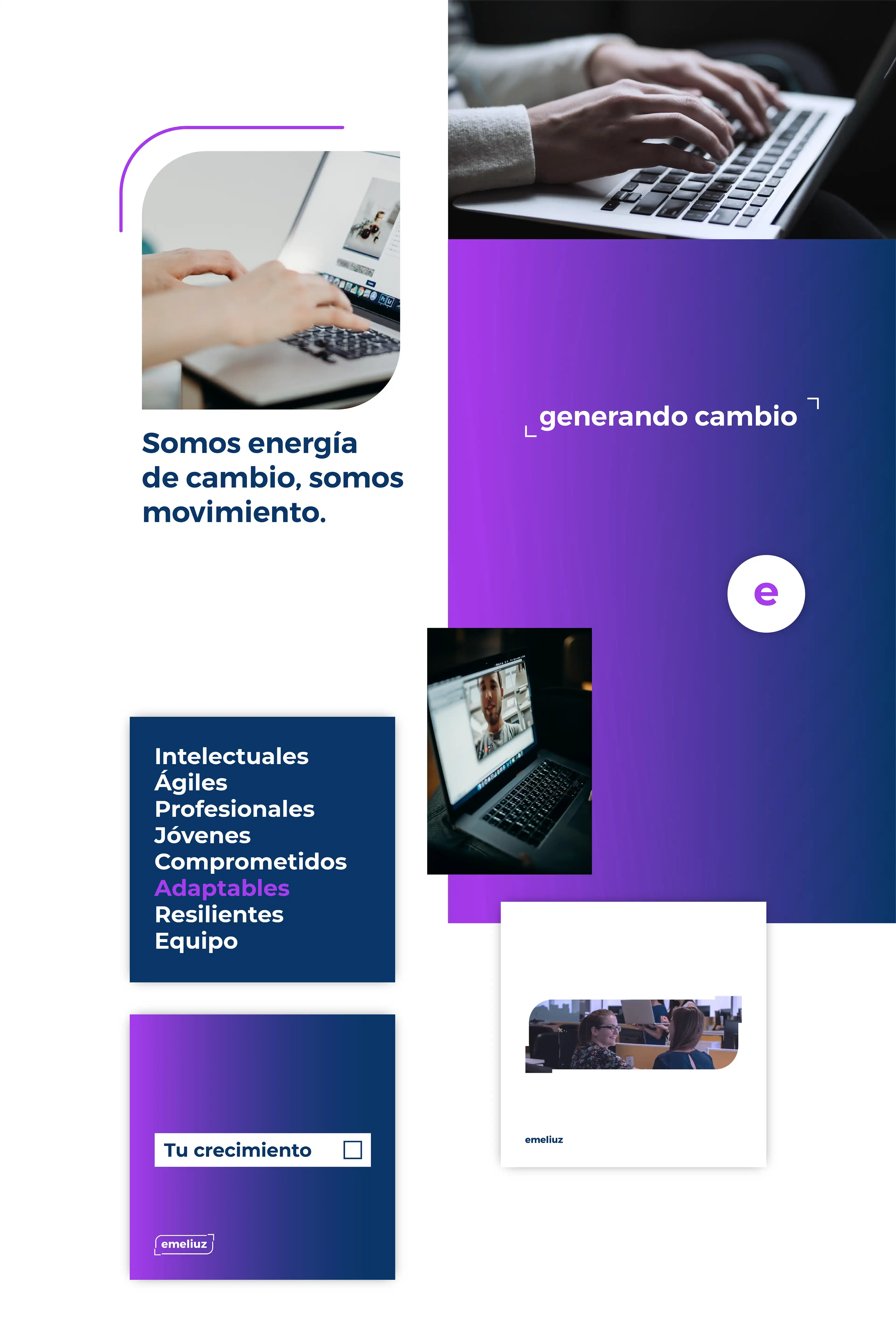
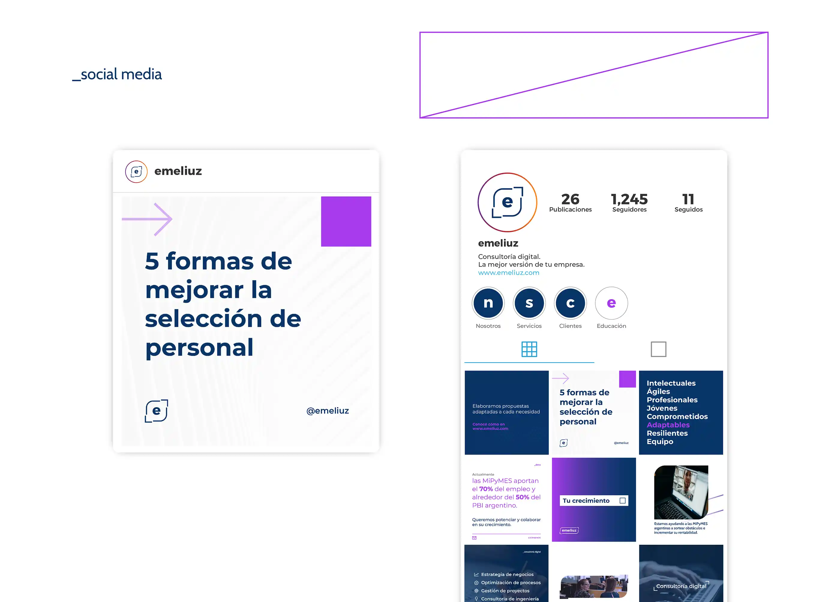
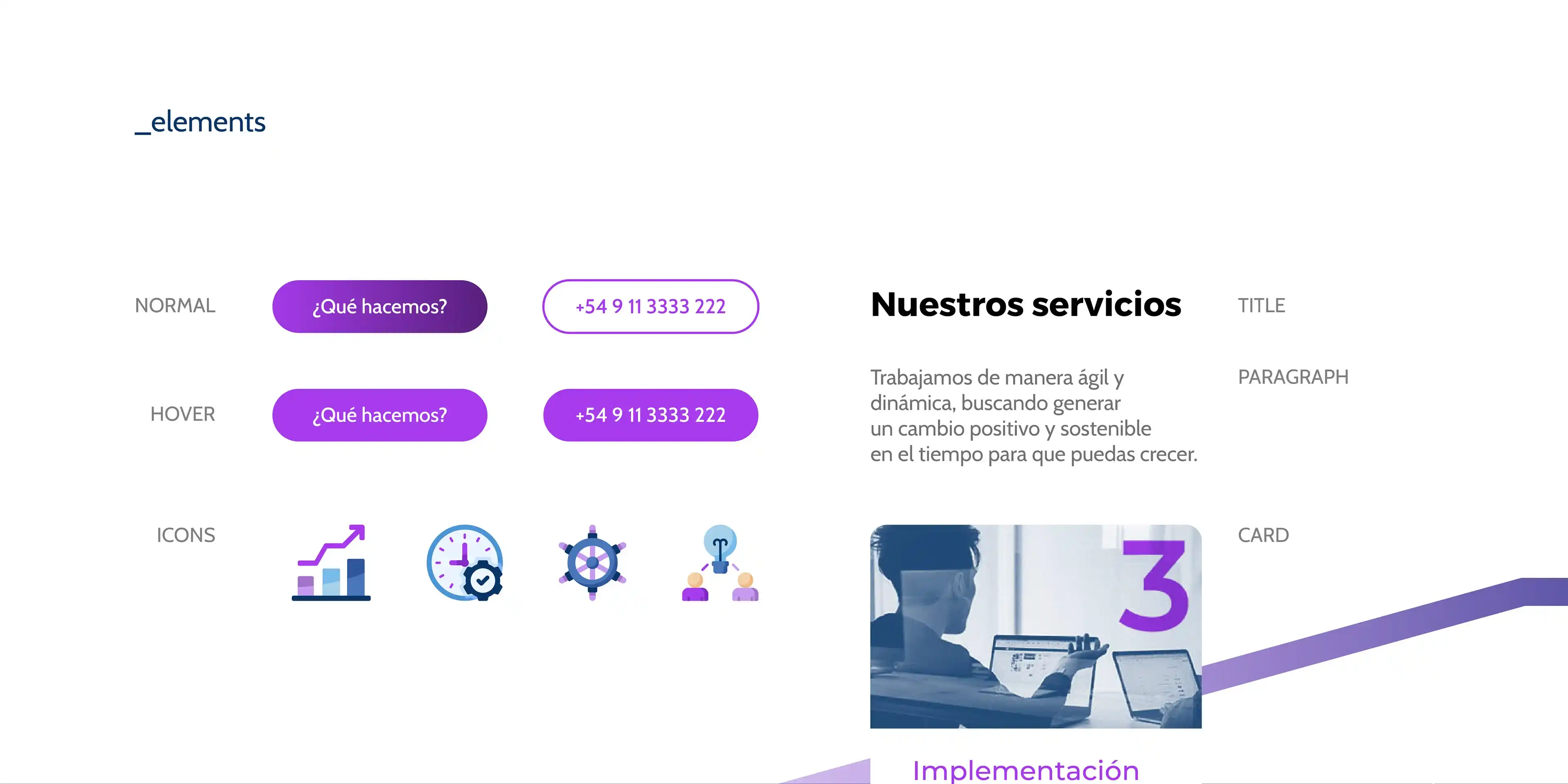
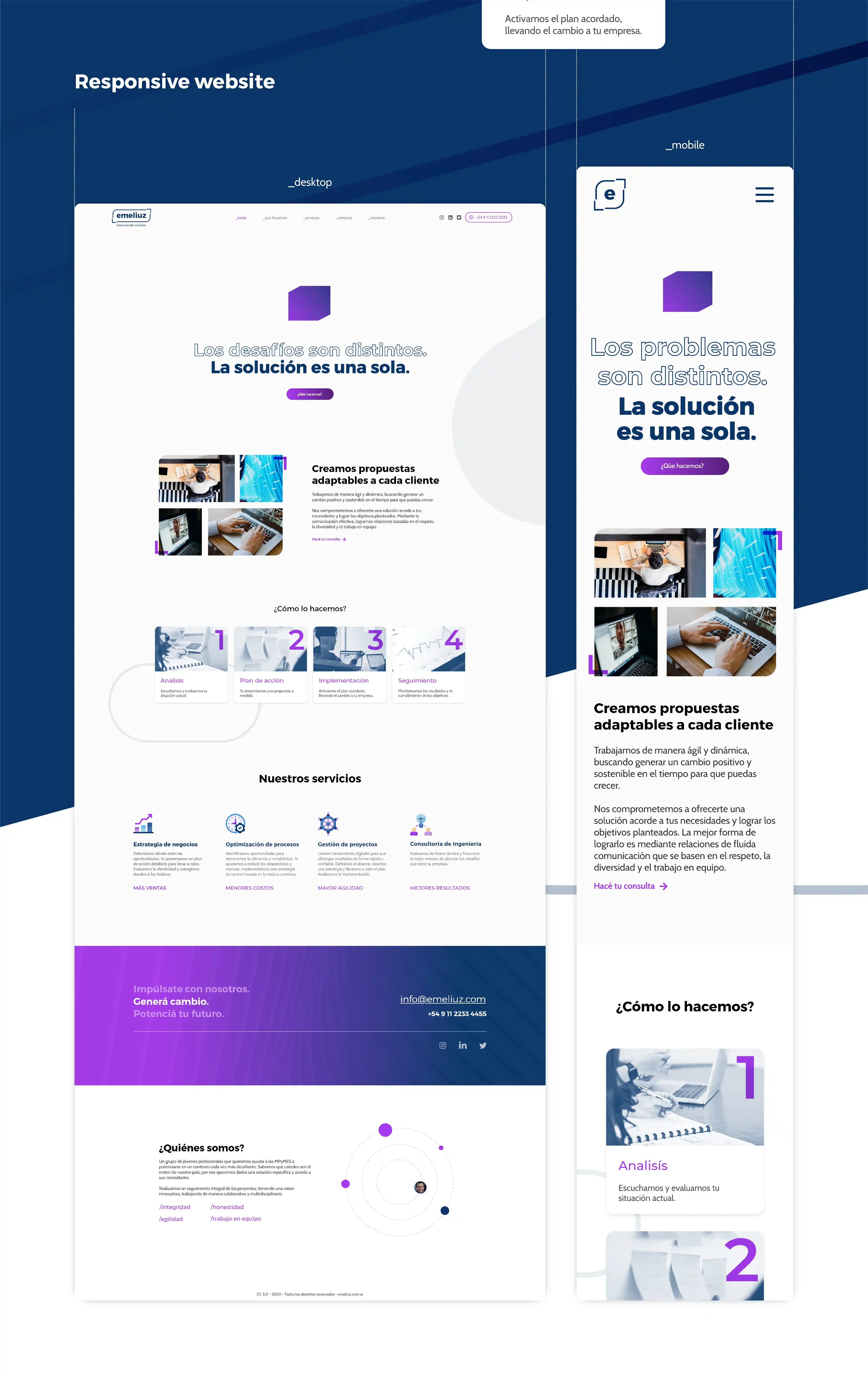
The website is the team's first impression with cold leads. It opens with a clear value proposition, walks visitors through the services in plain language, and closes with a low-friction way to start a conversation — no long forms, no jargon.